Monday, 14 February 2011

EVALUATION

In what ways does my media product use, develop or challenge forms and conventions of real media products?

For each aspect of our film, we identified ways in which we used the conventions of a short film and also if our short film developed or challenged these conventions.

In our film we stuck to the conventions when regarding camera shots and movements. Given that our film featured quite a traditional plot, in the sense that we had a soap styled plot, we wanted to stick to the more traditional shots as we felt it is what the audience would prefer. After doing some research on other short films of a similar narrative, we realised that the more traditional shots worked and displayed a familiarity that is also suggested through the family in the film. Various other films that are considered indie, tend to take a more avant garde approach because they have a target audience that will find it appealing whereas our audience will appreciate subtlety. For example, we used a close-up of the young girl’s eyes and then zoomed out. By focusing on the girls eyes we are focusing on her emotions. The audience literally get a closer view of how she may feel provoking a response of sympathy and pity. Our use of framing was also quite conventional when it came to the shot of Emma looking at the clock. As she is not centred, our attention is drawn to both her and the clock and it shows how she is waiting for her husband, making time the focus point. This again makes the audience respond with sympathy.

Unlike our camera shots, our narrative structure does not necessarily follow the conventions of a short film. Though we have followed the conventional exposition, development, complication and climax, we challenge the conventional by not having a resolution. Our choice to not have a resolution gives a sense of ambiguity to our ending. By leaving it open, there is a sense of tension which means the audience can make up their own mind and decide whether the parents will be okay or not. Allowing a sense of ambiguity to our film attracts the audience to make of the ending what they will. Suggesting a "will they, won't they?" ending, triggers the audience to
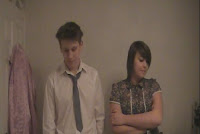


Above is a print screen from our film that shows the open ending of Torn.

When regarding sound we have followed the conventions. We used the song “Make you feel my love” by Adele. Like many other films or programmes, the song that plays in the background or foreground often links to the on-screen action. The song begins as Emma drops her head and we chose to use this as a cue as it communicates that that is the moment Emma’s character becomes more emotional and vulnerable. The song represents the feeling and emotions within the film but could be considered as quite ironic as it plays when the young girl is cutting up family photos. When we are shown the ‘heart’ we are of the understanding that her intentions were good and meaningful.

The mise en scene also follows the conventions especially when regarding costume and props. We chose our costume in order to represent the character. For example, the light purple pyjamas of the young girl highlight her innocence and the costumes of Jake and Emma (shirt and tie, blouse and trousers) represent a ‘homely’ and familiar feel. They also represent their roles; the father as the bredwinner and the mother as the homemaker. We chose to stick to the conventions in order to make the characters more relatable. The prop that was of most importance throughout the film was the scissors the young girl uses. Pairing the danger that scissors portray with the innocence of the young girl heightens the potential dangers that could happen.

Continuity is a standard convention of a short film which we have chose to follow. For example, when the girl is leaving up the stairs the camera follows her then the angle switches to us seeing her come up from the top of the stairs.

Later we cross cut the action down stairs with the mother and upstairs with the child. The frequent cross cuts represent that both characters are suffering. We also used fades at the very beginning and end of the film. I feel that the fade at the end is the most important as it lingers on and represents how the audience are still thinking and making up their own minds.

How effective is the combination of your main product and ancillary texts?


After completing the filming and editing process of our film we were to create ancillary texts to combine with our main product. In this case, it came in the form of our film poster and our film review.

As a group we discussed how we would like our film to come across to perspective audiences. We understood it wasn’t a horror or an action and that as it was a drama we agreed the poster and review should be more sophisticated and simple. Our plot was one with a moral and was considered thought provoking and we didn’t want to detract from that by crowding the poster or review with large WordArt font and too many different colours. Keeping the look simple, we agreed, was the most effective in our case because we remained consistent with the idea that the girl’s perspective in the film was the focus and by keeping the ancillary texts low key, we established this further.

After researching various other film review magazines, through independent research we discovered Little White Lies. After looking around the magazines website we began to understand that this was a more independent magazine. It also shared the same look that we were going for and through it’s reviews, it showed that the film was the most important thing as apposed the wardrobe choices, or how famous the actors were.

The example of a review from Little White Lies shows that there is more or less an equal image : text ratio. We also paid attention to the rounded edges of the picture which added tidiness to the page which helped us in our decision that we would use this magazine as inspiration to write our review. The colours within this magazine are low key too. They stick to a black and white theme with mainly the images being in colour meaning it is simple but not boring. The font was much understated also, as it didn’t feature any unnecessary art like “swirls”. When reading the text itself, it was clear that Little White Lies are a magazine that focuses on the camera work, the narrative and how successful the film is as a whole. They’re sophisticated in their language but not too informal. It suggests that the readers are mature and a mature audience is part of our Target Audience too. The simplicity of the review, combined with our film and poster establishes a brand identity. Ours being simple and traditional conventions with a modern twist.

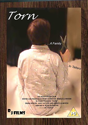
When it came to designing our poster the same rules applied. We included the title, a tagline and basic information without covering too much of the picture. Using the frame not only fit in with the picture theme of our film but also framed the poster making it look quite neat. We avoided using colour for the simple font we chose as, like our review, the image was the only colour on the page. This, again, made the picture the centre of attention and as the picture was of the young girl it suggested that she would be the protagonist. The poster, combined with the film is quite effective for the audience as they are able to grasp an idea of the genre of the film. Also by centering the child in the poster, suggests the child is being isolated. This poster acts as a foreshadow for what is to be expected in the film.


How did you use media technologies in the construction and research, planning and evaluation?


Here is a list of the technologies we used throughout the entire process:

HD Flip Camera
Internet –
Blogger.com
Dafont.com
Google.com
LittleWhiteLies.com

Adobe Premier Editing Software
Macromedia Fireworks 8


Using the Internet had huge advantages as it allowed us easy access to pictures to use as examples and inspiration for much of our ancillary texts like our poster for example. It allowed us to access more fonts than the ones that were available to us through WordArt. Using this was an advantage as it gave us more options enabling us to find a font most suitable for our poster.

Most of the technologies we used throughout the process had great advantages, including the Film Editing Programme we used. This allowed us to look more closely at our film and any continuity errors we had made. By using this programme, we were able to add much more advanced tricks that are impossible to do with just a camera for example the fade in and fade out we used. In turn, the editing allowed the story to flow also and perhaps made it more affective to the audience.

However, this is the one technology that had the most disadvantages as is set up many difficulties. During lessons in which we were editing, often the programme would take a while to download our files and when it would start, often the footage would jump/skip whilst we were editing the cuts between scenes. The jumping interfered mainly when it came to us including the fade it. As it jumped, it was unclear how long the fade lasted and if it was affective at all. However, we overcome this issue by using the time line scale instead of the scene one at the bottom of the screen. By using the timeline, we were able to estimate how many seconds would be suitable for a fade in. So despite us not being able to tell when viewing back, we were confident that we solved the issue through over means.

We also another media technology in the case of Fireworks in order to edit the image we used for our poster. As I have mentioned before in my blog, we used Firework tools such as the blur, smudge and sharpen tool. These were a huge advantage to have as it enabled us to blur the background surrounding girl, making her the focus point and also symbolically suggesting that everything around her is 'a blur' and she can't make sense of it all which gives the audience a further idea of the plot of the film.


What have you learned from your audience feedback?


After completing the entire filming and editing process of our short film Torn, we were eager to hear feedback from a mixed gender audience.

We were pleased to hear that most, if not all, of the audience were of the understanding that the genre of the film was Drama and that they understood what the film was about and were able to follow the storyline easily. When asked "Do you think the film has an ideological message and if so what is it?" the majority's response was "to consider others around you" and that "children are affected when parents argue".

The song we used to accompany the film was "Make you feel my love" by Adele. We were also very pleased to hear that everyone felt that it was "an emotional song that matched the story" and also that the song choice made them "feel for the characters". It was important for us to communicate a sense of sympathy for the characters ecspecially the young girl Rachel. We wanted the audience to sympathise with her in particular and as the audience felt the moral of the film was to be more considerate of the child, I feel we succeeded.

When asked "what was effective about the camera angles?" some responded, pointing out the effectivness of showing the child through the banisters on the stairs. They also appreciated the variety of shots that we offered.

We also offered them a chance to offer some constructive criticsm by asking them what they thought was weak about the film and do they have any suggestions to improve it? Those who answered this question said that it would have been better with more dialogue and they also commented on the visual quality as in sometimes, the picture was blurry and also the quality of the music as they mentioned it was too loud. Unfortuately, due to editing, the picture can often become less clear than it originally was. This is another example of a problem that we overcame.

What was interesting to see is that we had a more positive reaction and a clearer response from the female audience which suggests that this film is one that is more female orientated and would be more appreciated by a female audience.

We also had a chance to interview a few of our peers and filmed their response. It was good to get a response from an older audience as, you can tell from the video, their response is much more mature and that understand the aims of our director.


Friday, 26 November 2010

REVIEW: Editing final product

When editing our final product we not only had to edit scenes and cut and paste various clips and add in music but we also had to edit our film review.
When creating and editing our final draft of our film review:

We ensured that the text was in-line
Making sure the text boxes were the same size

Rounded the edges of the picture to fit the style of Little White Lies

Including their logo

Including ratings on right hand side

Fitting our writing to suit the style of LWL


Above, is a printscreen of the process of our first draft of our review. As you can see we continued with our simplistic colour scheme and kept the page as uncluttered as possible. However, we took into consideration that too much white space on the page makes it look empty and not as realistic. After looking into more examples of Little White Lies magazine we began to adjust the page layout to create this:

REVIEW: Drafting layout


In order to fit the style of Little White Lies, we had to incorporate their style into our review.
We noticed that they're very precise on the equal sizings of their collumns and they're very simplistic font.

REVIEW: Choosing most appropriate images


This is the image that we used for the film review. This is the very last shot of the film and, in our opinion, the most interesting due to it's ambiguity. It will capture the readers interest and make them wonder what has happened for them to look like this.

I also find the framing of the picture quite interesting. We purposly made sure that they were on either side of the frame to form some sort of symmetry. We wanted them to appear as equals towards the end to indicate that what happened between them was a question that was mutual.


Having the symmetry also made the page design for the review appear tidier and gave it that sophisticated review we were aiming for also. We used Little White Lies as our magazine to write a review for so it was important to design a page with equal sophistication and simplicity.

Here is an example of a review from Little White Lies.

REVIEW: Drafting text

As we had various ideas and we knew we would have to take the time positioning the text, we took it upon ourselves to brainstorm and simply bullet point ideas we had. We would later edit them to suit the style of the review magazine we chose. (Little White Lies)

http://www.littlewhitelies.co.uk/

-----

"However, credit must be shared, not just by the director and her technicians but with the performers too. The combination of Jake Taylor’s natural charisma and Emma Walsh’s heartfelt performance with a subtle yet mature narrative, make for a moving tale. Rebecca Winter captures the impressionable disposition of a young girl yet displays an understanding way beyond her years.

Though this film may not offer the clichéd fairytale ending that some hope for, it is the dramatic ambiguity that makes Torn emotive and self-reflective. But despite the unconventional denouement, the inevitable love between the parents is clear through stolen moments of tenderness.

· intrusive camerawork
· result is of substained skill and subtlety
· resembles with ‘fly-on-the-wall’ aspect in which we are presented with the ongoings in the family home and behind closed doors"

REVIEW: Researching different magzine audience's

Different magazines have different target audience's and as a group we had to research various magazines that would suit our style of film and our target audience.


According to http://www.fhm-international.com/mediakits/471EA25F13.pdf, "FHM is a multi-platform 18-39 channel". In a magazine the picture is the main focus. Though this paticular article is taken from http://fhm.com/, the video of the trailer to "Inglorious Basterds" dominates the page. Again showing that the text is not too important.


According to reports the readers of Empire are 76% male. But unlike FHM, Empire is an established movie magazine but with the percentage being mostly male orientated, it appears the films it reviews are generally of the genre that appeals to most men.

Knowing that neither of these are what we are looking for we did our own independent research into what magazine would be best suited to our film. As a group we decided that we wanted our review to feature in a film magazine as apposed to a generalist magazine. After doing our research we discovered the magazine Little White Lies. http://www.littlewhitelies.co.uk/


This is a cover of Little White Lies. It's more artistic and sophisticated which indicates that the target audience will appreciate films that have a sophisticated plot, similar to ours.

REVIEW: Analysing Design & Language Conventions of Magazine Reviews


(From left to right - Empire, FHM, Sight & Sound) In order to write our film review, it was important to determine which magazine we would use as inspiration based on their target audience.

We know our film is classified as a drama as apposed to a horror or an action and the more manly magazines like FHM and Empire, are more likely to review films that are action for example.

The readers of FHM aren't necessarily interested in lenghty texts that are in-depth, they prefer straightforward, summarising reviews ("who? what's it about?" headings) with a sense of humour.
The readers of Empire are interested more the review itself. It is mainly the writing that dominates the page. But despite the readers having a slight difference of interesents it's reviews are mostly about male orientated genres
Sight & Sound offers completely different language conventions. The language in the Sight & Sound reviews takes on a more sophisticated approach in it's laguage and design. The pictures are placed at the top then later, mid review. They're the same size and are both stills of the review.
When regarding the magazines themselves, FHM is not a film magazine so it's to be expected that the review would be brief, whereas in Sight & Sound, an established film magazine, there is much more text.

POSTER: Drafting/ Editing


Before


This is the image we used for our film poster. As we were planning to put a frame around the image, it had to be cropped. All of the editing was through Macromedia Fireworks.


We decided that as our framing suggests the girl is the main focus, we wanted to make that clearer so we blurred the area surrounding using the blur tool and used the smudge tool on the areas closer the the girl for precision. In order to make the scissors appear more dangerous we used the sharpen tool. By making the scissors sharper, it makes the girl appear more innocent, again provoking sympathy from the audience.


After

POSTER: Choosing most appropriate images

[Include other possible pictures for poster]

We had various other pictures we could have used but we decided to use the one of just the girl.
Choosing an image of the "parents" would not have conveyed the message that we wanted to give. It would have suggested a happy family, and having the title as Torn would have suggested that this happy family would perhaps be in trouble and we felt that was too obvious. Given the ideology of our target audience, we valued that an obvious poster would have almost been insulting. We wanted a subtle way of hinting that the protagonist (the young girl) is in some sort of trouble or danger (hence the scissors) without being too obvious. Having her back towards the camera made it more of a mystery as much like most of the film, we aren't entirely aware of her feelings or intentions. This mystery made the poster more intriguing therefore capturing a further interest and enticing an audience to watch the film.

POSTER: Exploring fonts


Here are examples of different fonts that we considered. We considered going with a paper styled font to represent a "torn" affect but also found that a fairy tale, more scripted style may suit also as it could represent the innocence of the young girl.
We mainly took inspiration from calligraphy on dafont.com

http://www.dafont.com/

POSTER: Sketching possible images/fonts

In order to create our film poster we sketched a rough drawing of the type of image we wanted:
It was important for us to make the scissors stand out as they conveyed a sense of danger. Having them as important point in the film poster suggests danger. Given the innocence of the young girl heightens the danger being suggested. This sketch is a mix of influences from everyone in the group. As a group, we decided that we would make the girl the center of the poster as it shows her importance of a character. We also made a decision to sketch a "frame" around her as it follows the theme of pictures and photos.

POSTER: Analysing conventions of film posters

In order to understand the conventions used to create a film poster, we analysed the poster to the film 'The Silence of The Lambs'.
Film posters are a crucial part of advertising as they attract a large amount of varied people. Posters often show that regardless of your preferred genre, you can be subconsciously interested in a film before you even know what it is about.

This poster for The Silence Of The Lambs is a good example of a film poster. The detail within the picture has an enigmatic nature. It also allows us to gain a rough idea as to what the film is about.
The close-up of the film poster shows that the skull upon the moth is made out of distorted images of naked women. It suggests that this could be a theme throughout the film and attracts the audience as due to it's disturbing nature. The moth is also covering the woman's mouth, which suggests an inability to talk or scream for help perhaps. Also the woman's eyes are also tinted a dark red colour suggesting danger.
After carrying out research of the conventions of film posters, it posed potential ideas for our own poster. Despite this poster having hidden meanings I like the subtlety of it. It inspired me to create a way of getting perhaps quite a deep meaning but through subtle ways for our own film poster.

Tuesday, 2 November 2010

FILM: Researching other short films

Before we could just go ahead and create our own short films, we saw it necessary to do some research into other existing short films by searching them on YouTube.

Researching various short films will give me an outline of what short films should, or should not, consist of.

One short film I researched was called "One Bad Day"


This short film is, to me, a prime example of how limited dialogue, or no dialogue at all, can still prove effective.

I also looked at another short film entitled "Picnic". This film aided me in realising the different conventions of a short film. For example the limited dialogue and also that the story doesn't necessarily have to be too complex.

FILM: Shooting schedule

A shooting schedule is necessary as it organises the crew and actors. Having a schedule allows everyone to know what is happening where and when. It also helps proffesional film makers keep to their budget however as we didn't have one this didn't affect us. Having the schedule, allowed us to know who was available and when. For example, Jake is unavailable on Mondays Tuesdays and Wednesdays so on those days so Rose and I will film then. Obviously we have to be flexible with our schecdule, because people might have other arrangements they cannot get out of, but organising ourselves at least lets us arrange other plans around these ones. Making filming our priority.

Here is our Shooting Schedule


FILM: Organising locations, actors etc

In order to make the filming run smoothly, it made sense for us to choose actors and locations that were flexible and easy to access.

As the film was about the relationship of a family, we made a unanimous decision to choose a family home as our set, choosing one of our own houses. When making this decision we took into consideration that by choosing one of our own houses to film in, it would mean we would always have access resulting in us being able to finish shooting within our deadline.

When it came to choosing our actors we made the decision, based on convenience and how comfortable we were acting with eachother. Jake and myself were in the film and we used our friend Emma as another actress. Emma had also featured in her film so we we knew that she was confident infront of the camera.

FILM: Storyboard

For similar reasons to creating a script, a storyboard is very useful in communicating the directors vision. It is not vital to follow the storyboard shot by shot because it's not always possible. Though we as directors originally wanted our film to be shot around early evening, given the time of year we are filming, this isn't do-able. Like professionals, we have had to adjust our ideas and plans this is why a storyboard is never concrete. Sometimes the message we want to get across to the audience isn't always achieved through what we had planned so we had to change things and try different shots with the camera. It's also quite use full to shoot things you haven't necessarily planned or thought of before because it gives you a wider variety of shots to choose from and you may end up creating something better than your original idea.

Here's an example of part of our storyboards


FILM: Scripting

In order to make the filming process run successfully, a script, is not only useful to the actors but also to the directors too. It communicates the directors vision and allows the actors to understand the message the director is trying to convey.


Within our script, we have made constant alterations but settled on our film finishing with an open ending. This way the audience will feel more involved as they can voice their own opinions about how they feel the film should end. Though the script is a good plan, it is not always crucial to stick to it word for word, much like the story board. Alterations are made for various reasons, sometimes the dialogue isn't as effective as first imagined, sometimes it may not seem natural and other times it doesn't suit the character and how the actor has decided to play it.


FILM: Developing a pitch

Thinking of the conventions of a short film allowed us to develop a pitch. With various ideas bouncing back and forth we thought about the strengths and weaknesses of each of them which ultimately helped us in deciding on our pitch.

Ideas
Creating bonfire, adding photo's to the flames.
A teenage culture inspired short film. Focusing on the affects of and making the right decision when it comes to drugs.

Originally we were going to go with the idea above but we realised the complexity of the idea would be hard to convey within 5 minutes due to it's narrative.


OUR PITCH

A mother and father are arguing and the father storms out (drives off.) Young girl (daughter), grabs the box of family photo's and begins to tear and cut the pictures. Father comes home, parents walk into their room to see the young girl has made a heart using the pictures she has cut up. Parents look at one another to suggest a "what will happen" ending.

Ending on a quite ambiguous note allows the audience to wonder and decide for themselves what they would like the ending to be. We hope, when creating this film the audience will enjoy the moral of the short film but the suspense will keep them interested.

FILM: Research into target audience

It is important to research into your target audience so you are aware how the message or meaning of your film, should there be one, will come across to others. Thinking of the ideology of our audience allowed us to then consider the meaning behind various shots, costume, props and dialogue.

Our Target Audience is male and female from young teens to early twenties. Having such a varied target audience could cause difficulty regarding our attempt to communicate our vision as directors however we didn't want to limit our audience in anyway because the message we wanted to convey was that the situation the young girl was in is one that anyone is or could have been in. The varied audience allows more people to identify with the subject matter and characters. The genre of our short film is Drama. Drama is a universal genre and is one that draws in quite a wide and varied audience.

Given the nature of our film we had an idea of the type of people that would be interested:

Kids as young as 12/13 as they can relate to the young girl in the film.
Teens as old as 19 as they can also relate to it but watch the film with a different perspective. They can perhaps identify with the young girl as they may have once been in a similar situation but can look back with a mature approach and understand the sentiment of the film.
Adults can also watch the film and understand the sentiment. They also can relate to the parent characters and perhaps reflect after watching our film.